Semplice is responsive
So is every other website builder these days. But we take it to another level.
FULLY RESPONSIVE
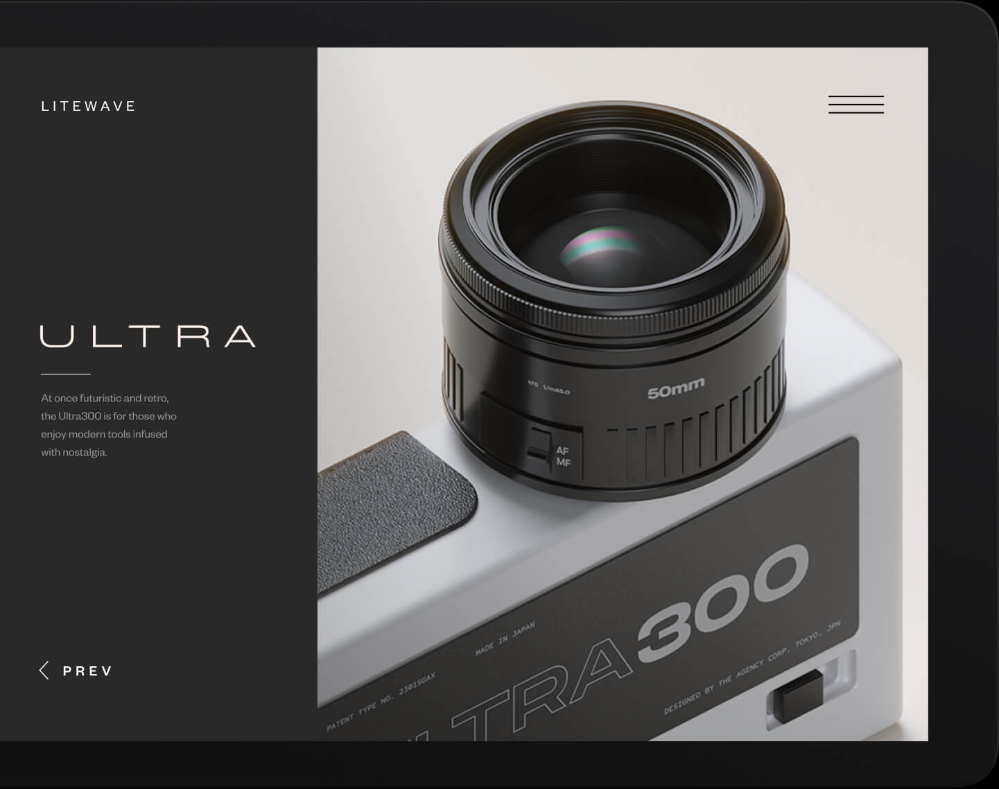
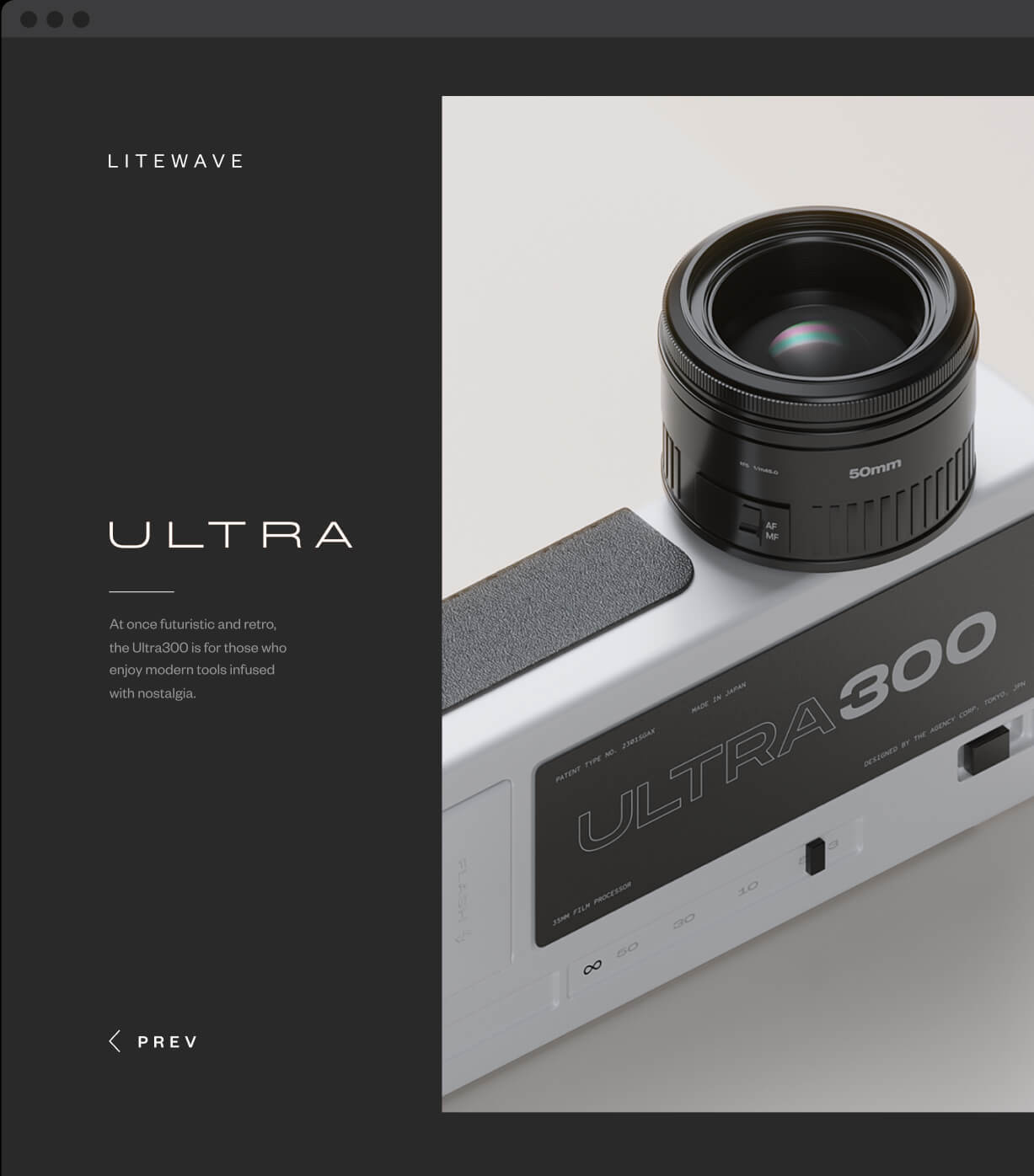
Perfect your designs for every device
Your site automatically adapts to mobile, but you can adjust column widths, typography sizes and layouts for individual breakpoints as needed. You're in control.
Work by Jon Vio


RESPONSIVE EDITOR
Change your columns and layouts for mobile
Stack columns or set them to multi-column view for mobile. You can even change the order of your columns.
RESPONSIVE TYPOGRAPHY
Typography transitions to mobile beautifully
Your typography will automatically transition to smaller screen sizes. Make individual adjustments for mobile as you see fit.
NAVIGATION EDITOR
Fine-tune your navigation
Make your hamburger and logo just how you want it, for each device view.
Illustration by Michela Picchi
More responsive features:
Set mobile image views
No more weird image cropping on mobile. Adjust your cover section image so it looks great everywhere.
Hide content on mobile
Control the experience on smaller devices by hiding or rearranging sections and columns for specific screen sizes.
Global text styles for mobile
Set mobile typography styles site-wide so you don't have to do it on every page. You can adjust these individually later.

Join the Semplice family & launch your portfolio
Semplice 5 is a new paid product, not a free update.
Already an owner of Semplice 3 or 4? Please read here.
Semplice 5 is a new paid product, not a free update. Already an owner of Semplice 3 or 4? Please read here.

