Refinement, not reinvention: Meet the new Semplice logo
Refinement, not reinvention: Meet the new Semplice logo
Refinement, not reinvention: Meet the new Semplice logo
Refinement, not reinvention: Meet the new Semplice logo
Refinement, not reinvention: Meet the new Semplice logo
→ A letter from the designer, Mackey Saturday
→ A letter from the designer, Mackey Saturday
Semplice translates to “simple” in Italian. The Semplice brand has always stood behind that name, providing simple tools that help designers build with pride.
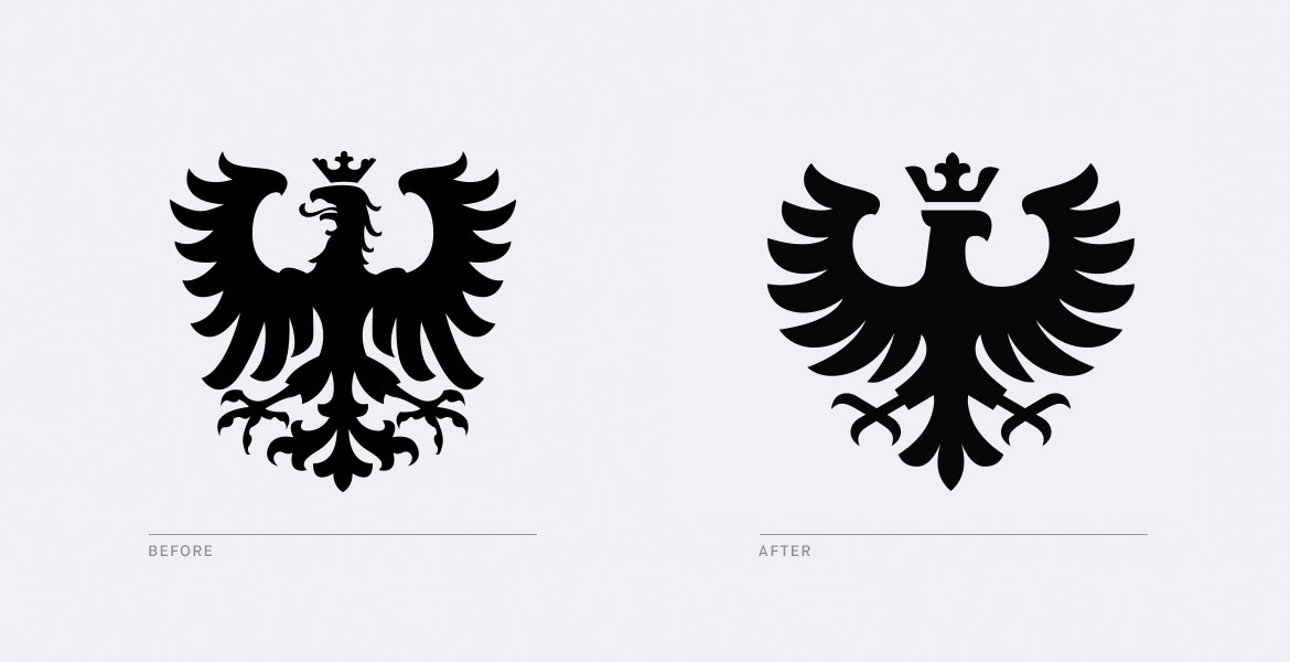
The Semplice logo, however, was not so simple. The eagle was busy, composed of many elements and not streamlined to maintain integrity as it scaled. It was difficult to preserve the character of the shape and use it consistently at all sizes.
As Semplice continued to grow, it needed an identity as considered as its offering.

Consistency is one of the most important functions of a logo. Therefore refinement, not reinvention, is often the best step forward. Despite its flaws, the Semplice eagle had meaning. It evoked strength and pride, attributes the Semplice brand is built upon. Together with the bold shade of yellow, it represented the product and the community of people dedicated to it. We didn’t want to lose this equity or make the logo look like every other company in the space, but it needed to function better. Most importantly, it needed to align with the quality one expects from Semplice.

With the new logo, we reduced the total number of elements considerably. We sought strong silhouettes for each of the eagle’s valuable features: Seven feathers instead of nine on each wing. Three talons instead of four, formed from two total shapes. One tail feather instead of three, and one shape for the beak. We turned the eagle’s head to look toward the name, reading as one element, and increased the proportion of distinct pieces like the crown. We streamlined every detail.
The result: A clean and elegant evolution of the Semplice eagle that scales beautifully. Still familiar, but now fit to lead Semplice into the future. Side by side, the change is significant. But ultimately, it’s still the symbol we’ve come to associate with Semplice. It’s simple.
—
Mackey Saturday creates identities for some of the world’s most recognized brands, including Instagram, Oculus and Silk. See more of Mackey's work here.

